Introduction
The DataFlex Styler is a free online utility that can be used to create custom themes for DataFlex Web Applications. It currently supports customization of the Material, Flat Touch and Flat Desktop themes that are part of the standard DataFlex WebApp Framework. For Flat themes, colors can be customized. In addition, Material themes allow design personalization of fonts, list and grid borders, control and button color, font, size and radius. The tool is available at DataFlex Styler.
Updates
See the DataFlex Styler Updates page to see what we have done to make the Styler an even better tool.Login
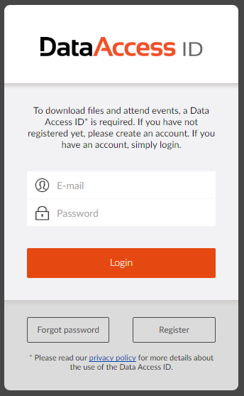
To login into DataFlex Styler, use your Data Access ID. Data Access ID is a single sign on system that works for multiple online services of Data Access Worldwide. If you don’t have an account yet, you can sign up free of charge by clicking the register button. It will automatically remember your login the next time you open the DataFlex Styler. Note that if you logged on to your Data Access ID using a different service, it will automatically login to the DataFlex Styler as well.
User Interface
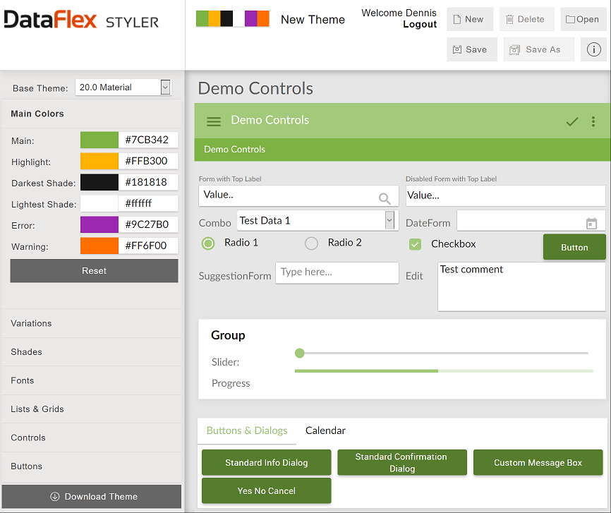
The user interface is separated into various groups. Depending on the base theme you choose, various option groups will become available or not. The toolbar on top shows details like the theme you are working on, which user is logged in and buttons to create, save and open themes. On the left is the working pane that shows the options that can be customized for a specific theme. The first option is the Base Theme, which determines the theme that should be used as the basis of your custom theme. The bottom of this panel shows the Download button, which can be used to actually generate and download the theme.
The remaining space on the screen shows a preview of the theme you are generating. Note that the preview is like a running application, so as you apply options in the working pane, they will apply immediately to the preview on the right You can also interact with the preview to see application features in action (some of these pop up additional dialogs and controls that also have the theme applied.
Clicking on an option group may switch to a different preview model on the right. This is to ensure that the type of options you are current setting are actually shown in the preview.
Clicking the Reset button in any options group will reset that option group to the default
settings (other option groups will remain untouched, so you can safely
play around with any option group and reset it without losing progress
in other option groups).
Creating Your Theme
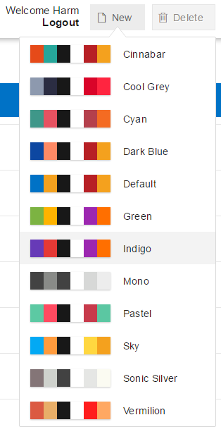
To create a new theme you can click the new button. This pops up a list of predefined templates providing a good starting point for your theme. After choosing the basic color scheme you choose on which theme your theme should be based by changing the Base Theme combo in the working pane.
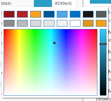
Now it is time to change some colors. The main colors are shown in the first section and are the important colors used in the theme. Clicking on the color pops up a color picker that allows any color to be selected. On top of the color picker you find the original colors of the template. In the collapsed groups different variations of the main colors can be picked. A checkbox determines if you want these customized or automatically calculated, if this checkbox is checked the forms below are disabled and the system calculates the colors based on the main colors. Next to the variations are the shades that can be customized.
Clicking the Reset button in any options group will reset that option group to the default settings
Additional Options
If you choose a Material Base Theme, additional styling options become available to you. You will see goups for Fonts, Lists & Grids, Controls and Buttons.
Clicking the Reset button in any options group will reset that option group to the default settings
Fonts
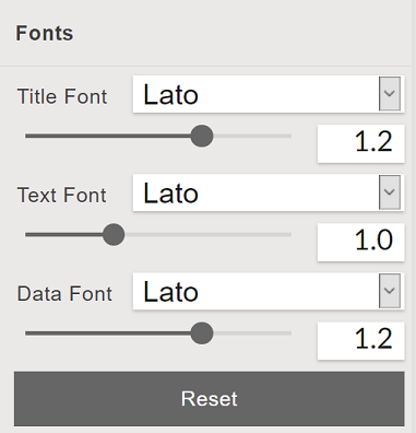
You can set fonts and font sizes for Titles, Text and Data.
Clicking the Reset button in any options group will reset that option group to the default settings
Lists & Grids
You can choose styles for List and Grid, row and cell borders.
Select border (top, right, bottom, left) to apply it. Borders must have
a minimum width of 1 to appear (if the width is 0, borders will not
appear, even if border styles are set). You can also apply padding for
all border types.
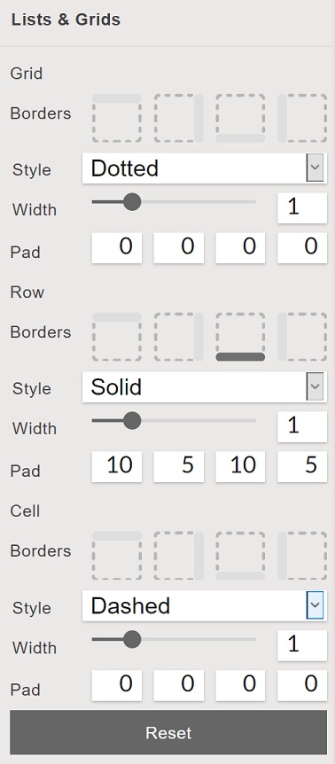
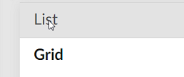
Click on List or Grid inside the preview on the right hand side to toggle between previews for either of these classes.
Clicking the Reset button in any options group will reset that option group to the default settings
Controls
You can set numerous styling options for controls like cWebForm, cWebEdit, etc (except for Buttons, which have their own styling group). Borders must have a minimum width of 1 to appear (if the width is 0, borders will not appear, even if border styles are set).
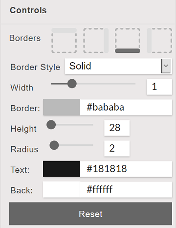
Radius applies rounding to control edges.
Clicking the Reset button in any options group will reset that option group to the default settings
Buttons
You can set numerous styling options for Button controls. Borders must have a minimum width of 1 to appear (if the width is 0, borders will not appear, even if border styles are set).

Radius applies rounding to Button edges.
Clicking the Reset button in any options group will reset that option group to the default settings
Saving Your Theme
The DataFlex Styler allows you to save multiple themes. The themes are stored on a web server and will be available the next time you login. The Save button in the toolbar on top can be used to save a theme. If this button is clicked for the first time, it will ask for a theme name (the theme and name are private to you, so choose a name that makes sense to you). The next time you login, it will automatically open the last used theme; you can also use the open button to explicitly load a saved theme.

Downloading Your Theme
Of course you'll want to apply the theme to your own DataFlex application. To do this you click the download theme button at the bottom of the working panel.

A dialog comes up that asks for the final name of the theme. Only alphanumeric characters without spaces are allowed, so the suggested name might be different than the name under which you’ve saved your theme. After clicking OK, it will generate a zip file with the complete theme and offer this as a download.
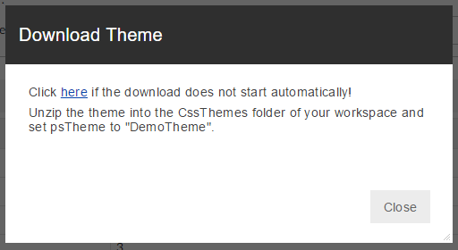
Depending on the browser it will automatically download or ask where to store the theme. If it did not start automatically you can click on ‘here’.

Installing Your Theme
The zip file that you’ve downloaded contains the theme directory for your theme. You can unzip this to the AppHtml\CssThemes folder of your workspace.
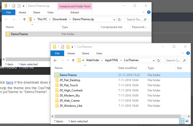
Now you can open your workspace in the DataFlex Studio.
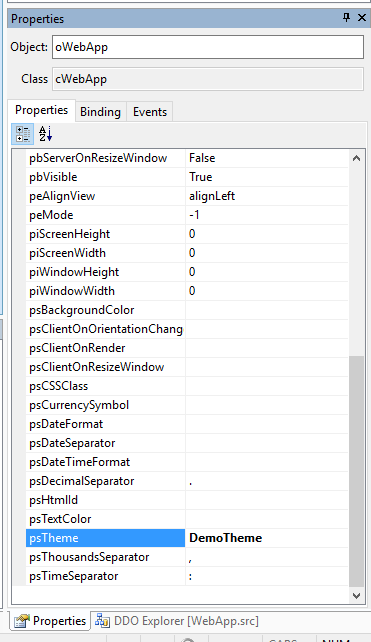
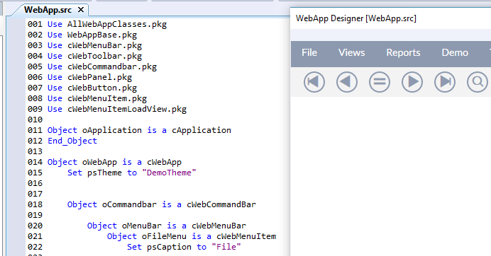
To activate the theme simply change the psTheme property of your oWebApp object to the name of the theme (the name of the folder in CssThemes). This is done by opening the WebApp.src and finding where psTheme is set in source code or selecting the object and using the properties panel.
